The University of the Ryukyus (Ryudai) designates its official emblem, typeface, and tagline, and set guidelines for their usage.
Documents below written in Japanese.
琉球大学章規則
国立大学法人琉球大学ユニバーシティ・アイデンティティに関する規程
国立大学法人琉球大学ユニバーシティ・アイデンティティに関する取扱要項
琉球大学UIガイドライン
University Emblem
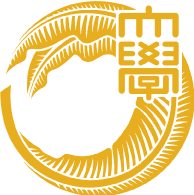
In 1980, the University of the Ryukyus adopted its official emblem, which had undergone minor modifications since the university’s establishment in 1951. Professor Chosho Ashitomi and designer Kaoru Miyara were responsible for the final design upon commemoration of the university’s 30th anniversary.
At the heart of the emblem is a combination of leaf of the basho plant, or Japanese banana (or Musa basjoo in scientific name) and a pen quill. The leaf symbolizes nature and cultural traditions of the Ryukyu archipelago, and the pen quill symbolizes academic inquiry and freedom. The combination of the two in a circle represents peoples’ harmony and the universe.
※ The size and colors are defined in the guidelines for the University of the Ryukyus’ emblem.
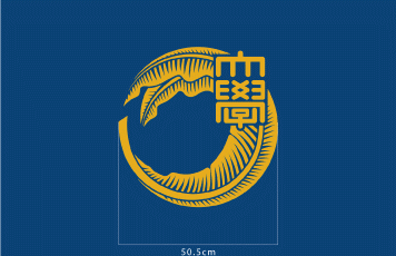
University Flag W 125.5 cm × H 84.5 cm
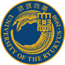
Emblem
The university emblem is an updated version of the 30th anniversary emblem. The University of the Ryukyus appear both in Japanese and English and the year of the university’s foundation encircle the university emblem, making it instantly recognizable.
Type face
The typeface for the University of the Ryukyus should be used according to the guidelines.
※ Only the following typefaces may be used in conjunction with the university emblem.

Combination of Ryudai Emblem and Typeface
Two university logos have been created which combine the emblem and typeface. The ratios between emblem and typeface are shown below.

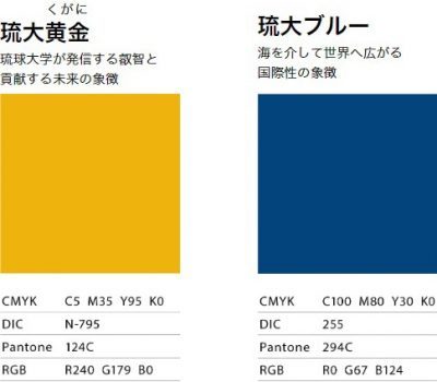
Official Colors
The official university colors are determined as below. They are known as Ryudai kugani, or gold, and Ryudai blue.
Communication Logo
The Communication Logo is a secondary logo which communicates with the public in a more light-hearted way. While the University emblem is used in official capacities, the Communication Logo can be used in more casual occasions. At the center of the logo is a circle of Ryudai kugani gold, which symbolizes creation of island wisdom, and it is encircled by seven quarter circles, each representing the globe’s seven seas. The island wisdom emanates across the seven seas and beyond. The configuration also symbolizes the diversity of the University of the Ryukyus.
* Trademark application pending.
![]()
Tagline
The tagline concisely expresses the University of the Ryukyus’ aim to disseminate island wisdom to the world and to future generations.
![]()
History of Development
Document below written in Japanese.
琉球大学ユニバーシティ・アイデンティティの開発について
Usage
The University emblem and Communication logo may be used in a variety of contexts, including websites, business cards, envelopes, letterhead, and presentation slides.
Documents below written in Japanese.
国立大学法人琉球大学ユニバーシティ・アイデンティティに関する規程
国立大学法人琉球大学ユニバーシティ・アイデンティティに関する取扱要項
琉球大学UIガイドライン
If you wish to use the University of the Ryukyus’ official emblem, typeface, Communication logo or tagline, contact the Public Relations office for more information.